Archive
Café Gringel
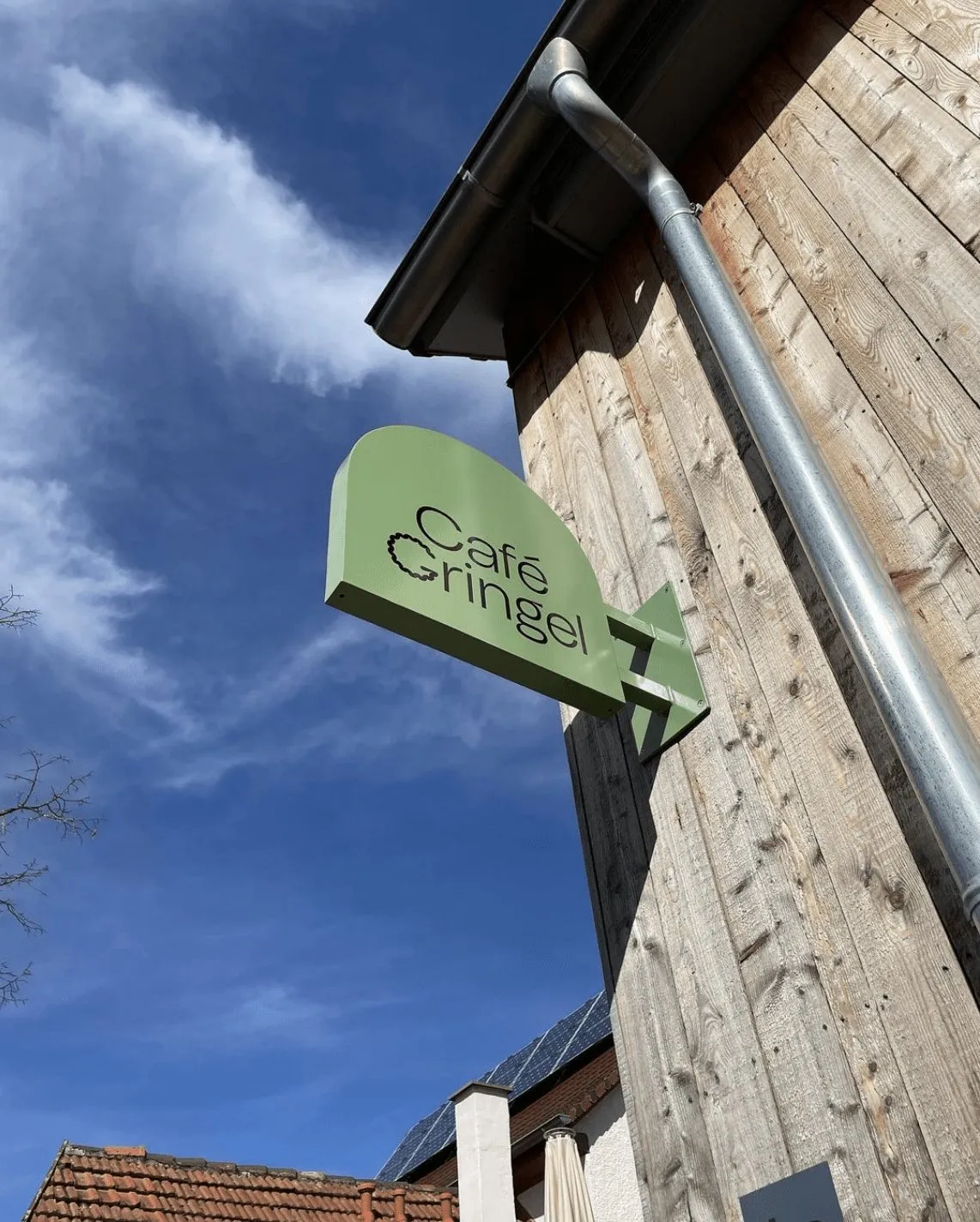
Logo, colours and shop sign for a café opposite the church.
- Branding
- Branding
G as in “Gringel”.
The “G” in Gringel takes the shape of a Kringel, the ring-shaped pastry served with coffee. “Gringel” is the dialect word for it and the origin of the name. Colours and arches come from the church opposite: the palette from the façade, the arches from the church windows.
Website
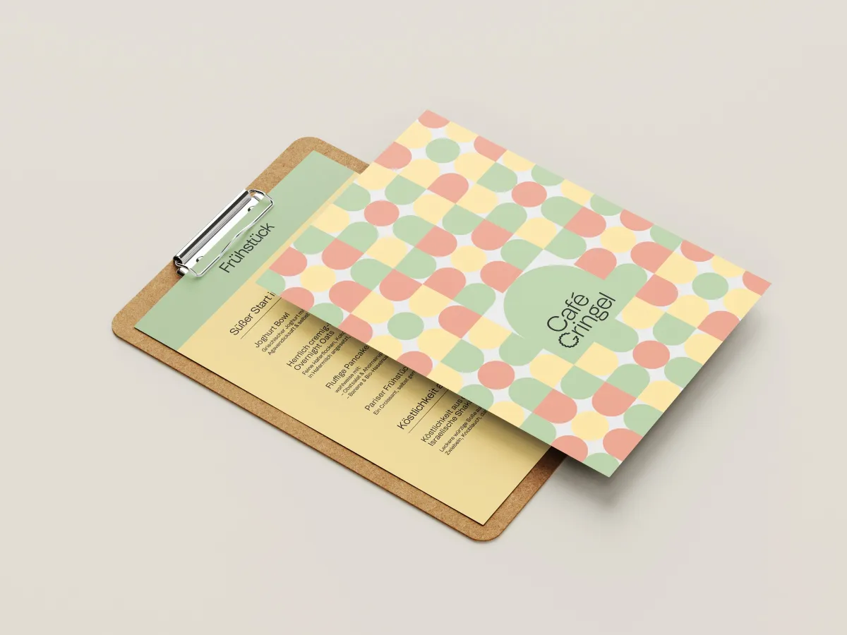
The arches are online too.
On cafegringel.de, the church arches reappear: as image frames, as a window for the logo and in the menu pattern. The base colour is the green of the façade.