muli Cycles
Concept, UX and design system for a shop that grows with the product range.
- Web
- 2025
- Web
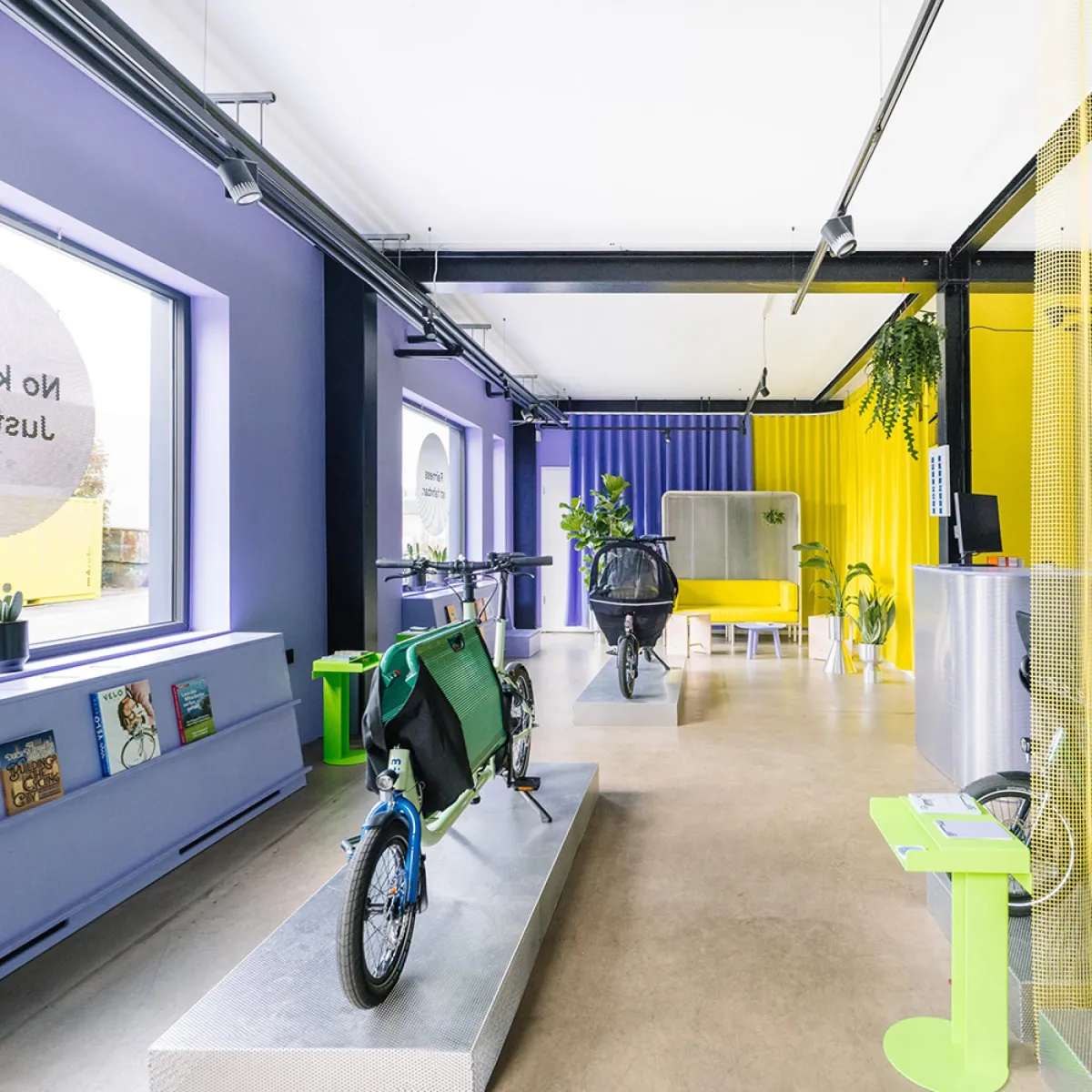
An online shop that feels like the muli showroom.
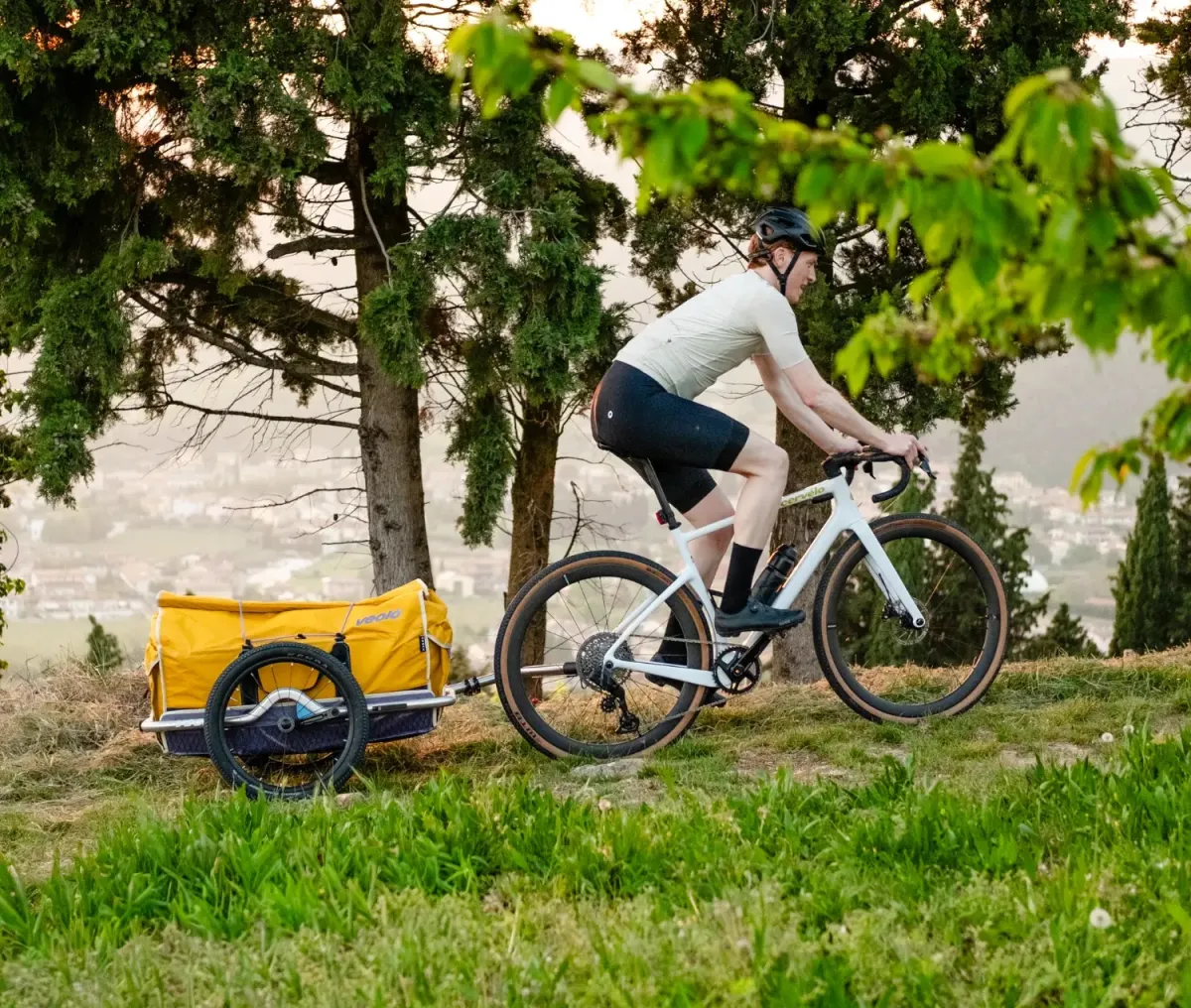
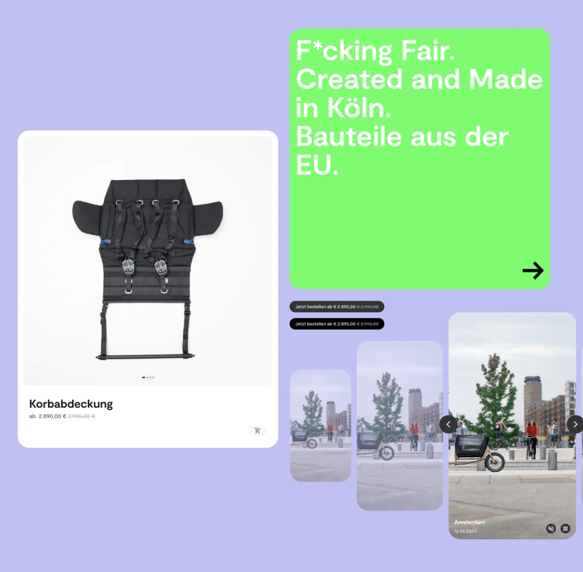
muli Cycles builds compact cargo bikes, fairly produced in Cologne. The old site had been built for a single bike, and with the BOX and new variants it couldn’t keep up: the structure was cluttered, the checkout was clunky, and little of the brand’s cheeky attitude made it online. In 2025 we rebuilt the concept, UX, UI and design system, working in workshops with the muli team and testing on prototypes. Studio Bosco developed the site.
- 4 section colours
- 5 models, one configurator
- 150 pages, one grid
The 3 key features
Real screen recordings from muli-cycles.de, showing the site as visitors see it today.
-
01
From configurator to basket
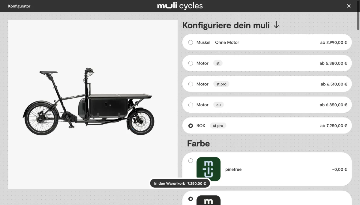
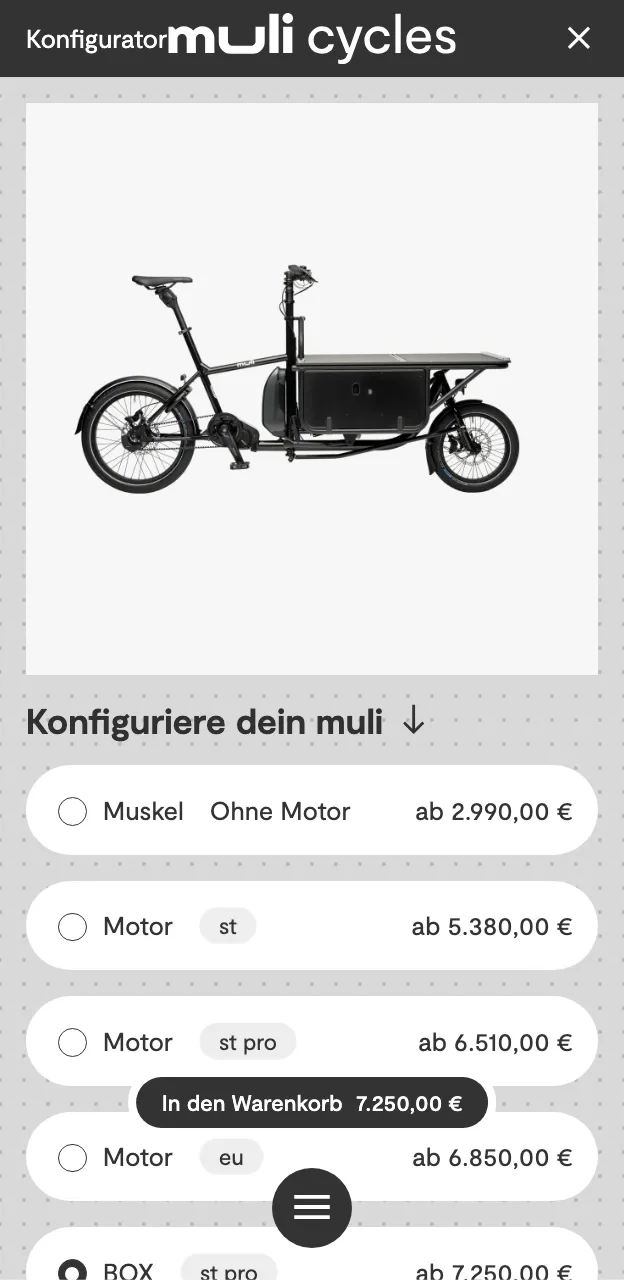
Pick a motor, switch the colour: the bike changes with it instantly and the price keeps pace. One click and your very own muli is in the basket.
-
02
A menu with two faces
At the top of the page, the menu shows every route, submenu included. Scroll down and it shrinks to a slim bar: Home → Bikes → BOX. Scroll up a touch and every route is back.
-
03
Every section has its colour
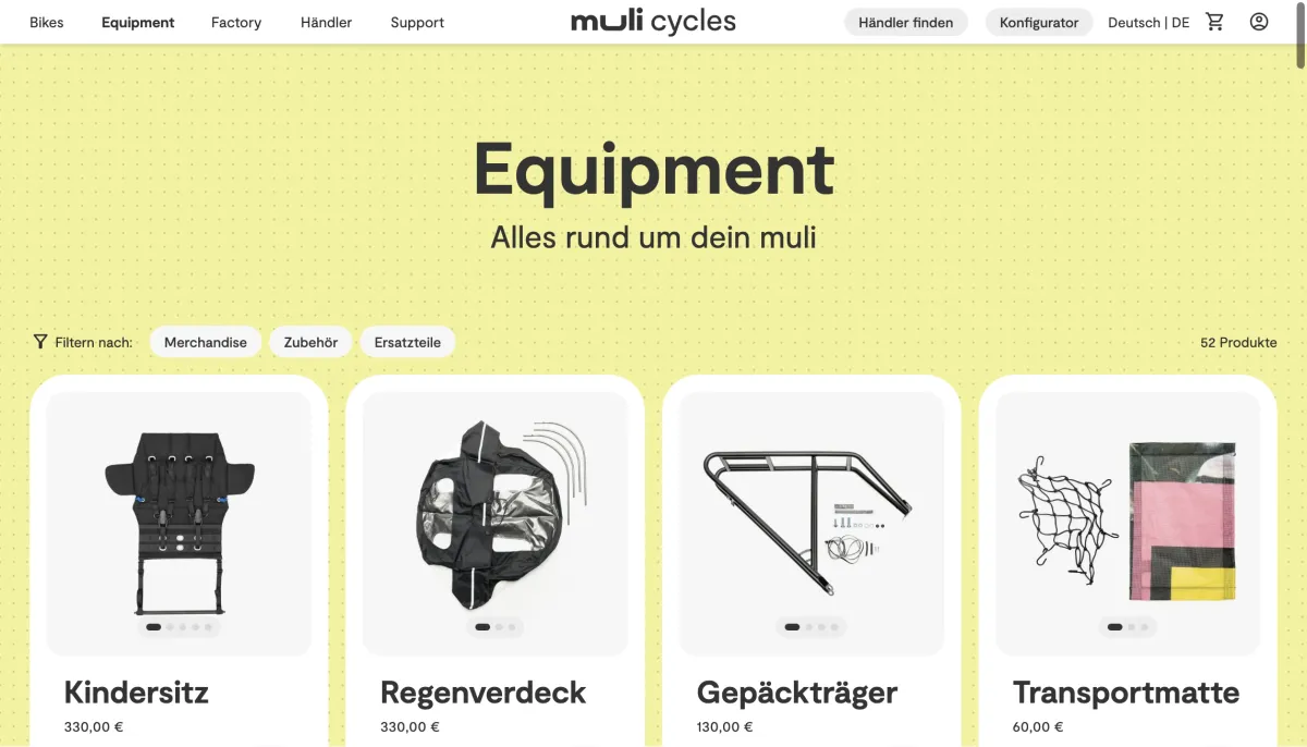
From the home page to the bikes and on into the Factory, the background colour changes with each section while the dot grid stays put. So with every click you know where you’ve landed.
The website in detail
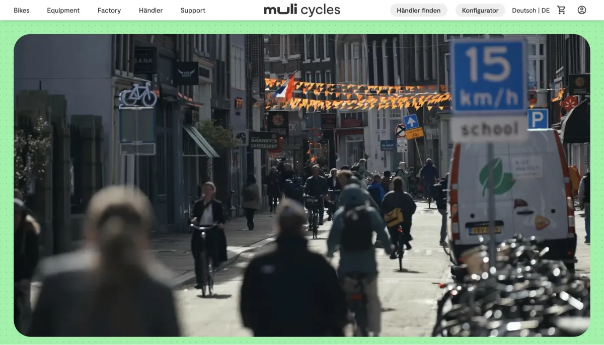
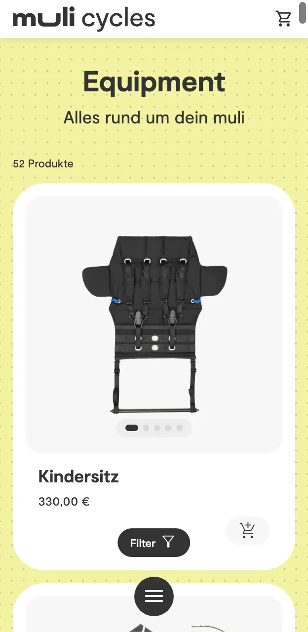
The same page on desktop and mobile, captured on muli-cycles.de.
-
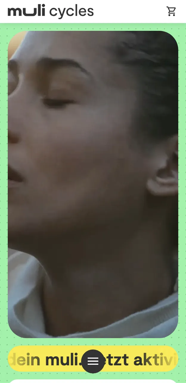
Home page
-
Configurator
-
Equipment
The system behind it
-
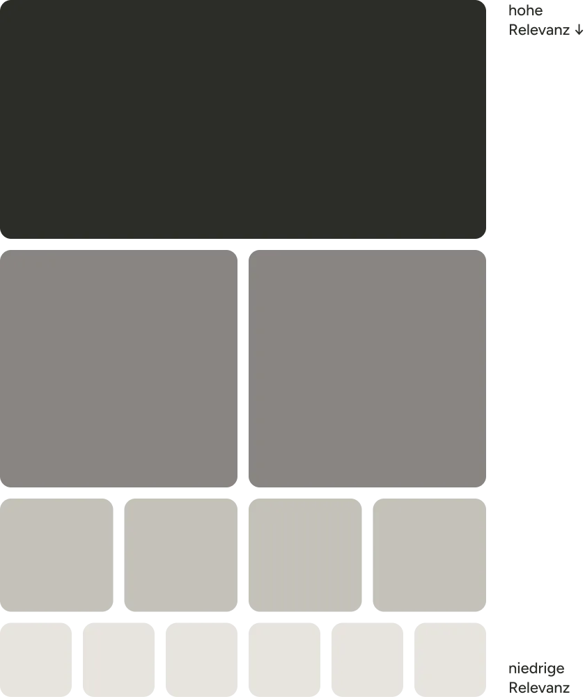
A grid built on relevance
What matters goes big and can take any format. What comes up often gets a fixed aspect ratio. So everything stays in order, however much is added.
-
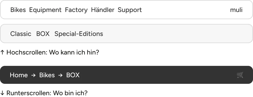
A menu with two modes
Scroll up and the menu shows where you can go; scroll down and it only shows where you are. That keeps the site easy to find your way around, even with lots of models and 150 pages.
-
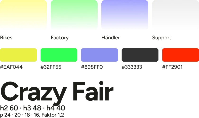
4 colours for 4 sections
Home green, Bikes yellow, Factory green, Dealers purple: each section has its own colour, fading into white over a dot grid. New content slots in without anyone having to redesign a thing.
-
The shop now looks like muli: fair, cheeky and a bit crazy. Not like a template.
The brand
Anyone who knows muli from the showroom or the street now meets the same brand online. That builds trust before anyone has even seen a price.
-
From first glance to basket: a clear path, not an obstacle course.
The purchase
When people see their own bike while putting it together, there’s nothing left to guess. Curiosity turns into an order more easily.
-
New models slot in like the box in the basket.
Growth
The next model doesn’t mean rethinking the site. A launch becomes a question of content, not design, and the brand stays the same throughout.
-
The menu always tells you where you are.
Orientation
People who know where they stand are happy to go deeper into the shop. With so many models and so much equipment, that’s what makes browsing possible.
Want your shop to do more?
Tell me what you sell and where things are getting stuck. You’ll get an honest assessment and a price before we start.
Start a project