squiq
Logo and photography for a young outdoor label that builds camping kitchens into the boot.
- Branding
- Photography
- Animation
- since 2024
- Branding
- Photography
- Animation
Everyone wants to get outside. squiq brings the kitchen along.
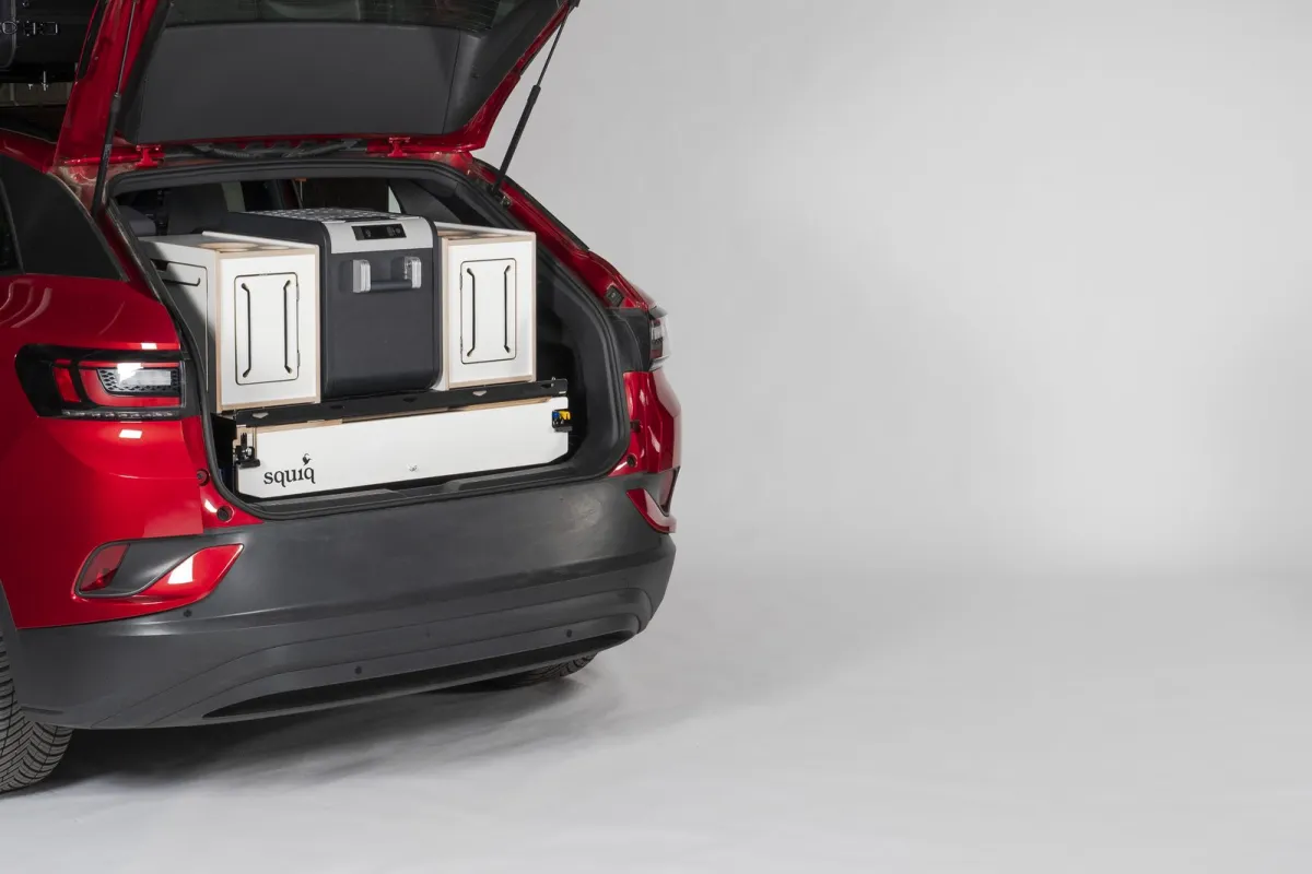
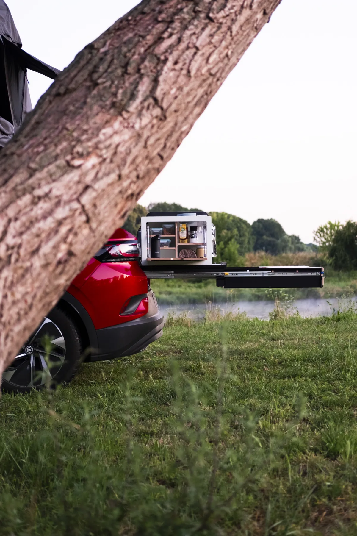
squiq develops pull-out kitchens for the boot: tailgate up, drawer out, and the car park by the sea becomes a kitchen. When the brand launched, there was just a first logo. We redrew the brand around a kingfisher and have been behind the camera for squiq ever since: lifestyle shoots outdoors, product photos and animations in the studio.
- 1 kingfisher
- 3 models in the studio
- 400+ images from two shoots
Brand, outdoors, studio
Three chapters, from the first logo draft to the studio animation. All images from our own shoots.
-
 01
Local hero: the kingfisher
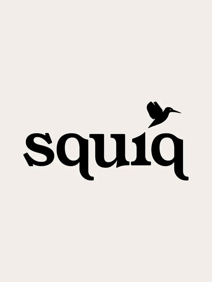
Three directions, one animal: the kingfisher stands for calm by the water, Leipzig’s floodplain forest and that one fleeting moment. We reduced it to a clear silhouette and paired it with a warm serif typeface that stays friendly even at small sizes on the box.
-
 02
Outdoors, where the kitchen belongs
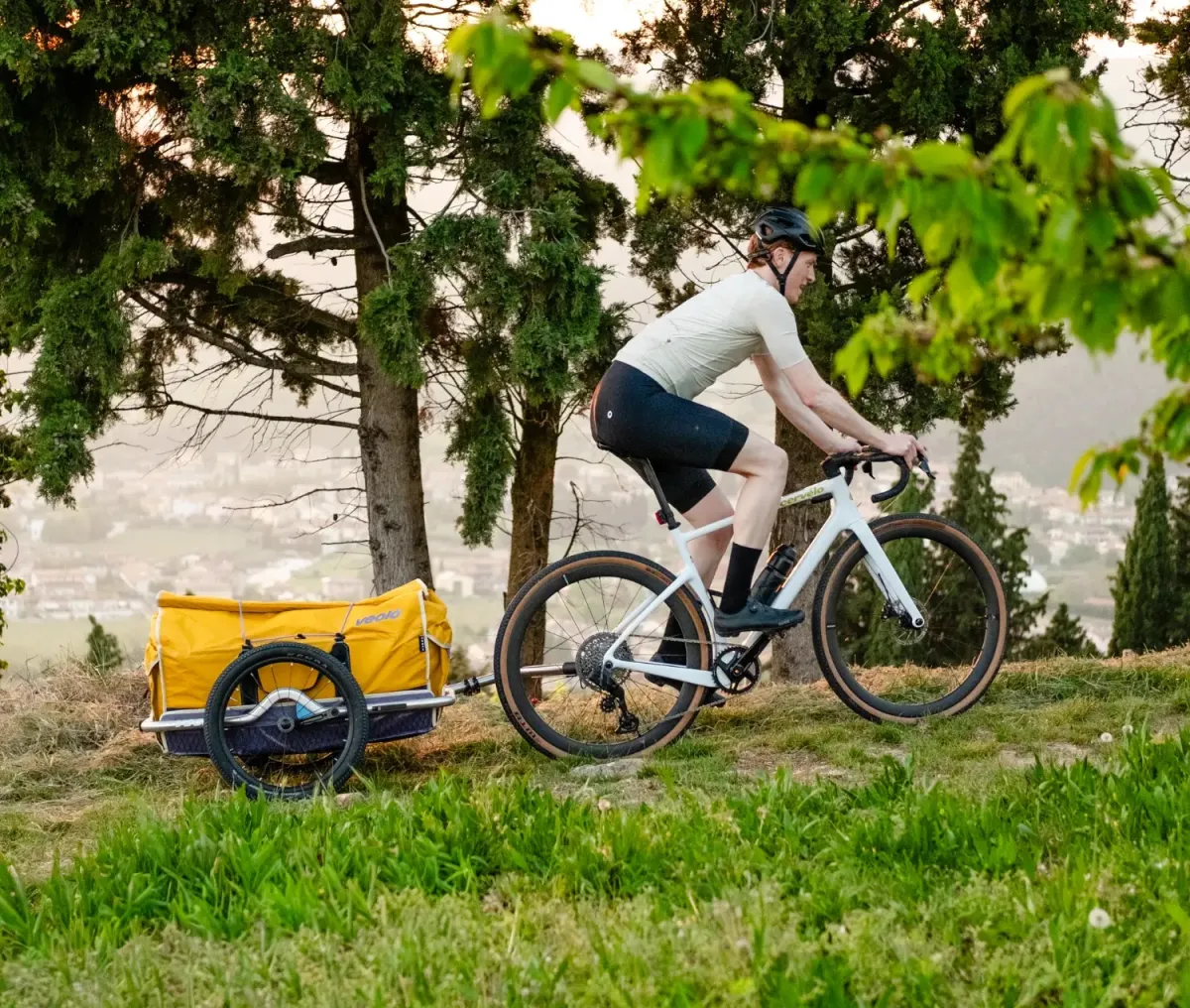
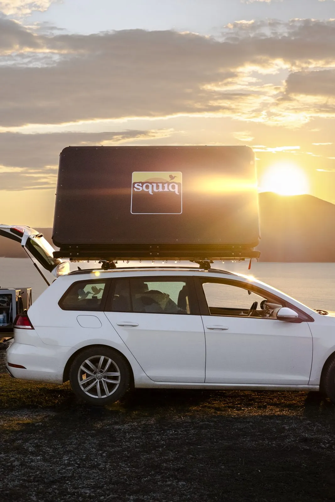
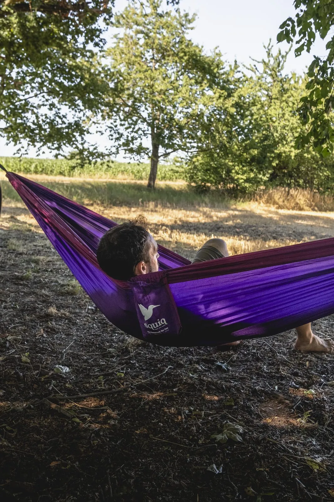
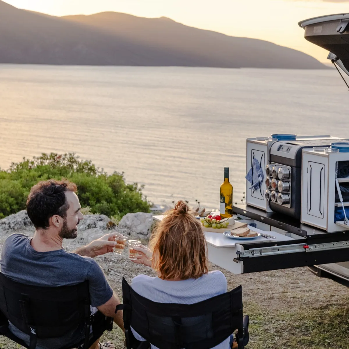
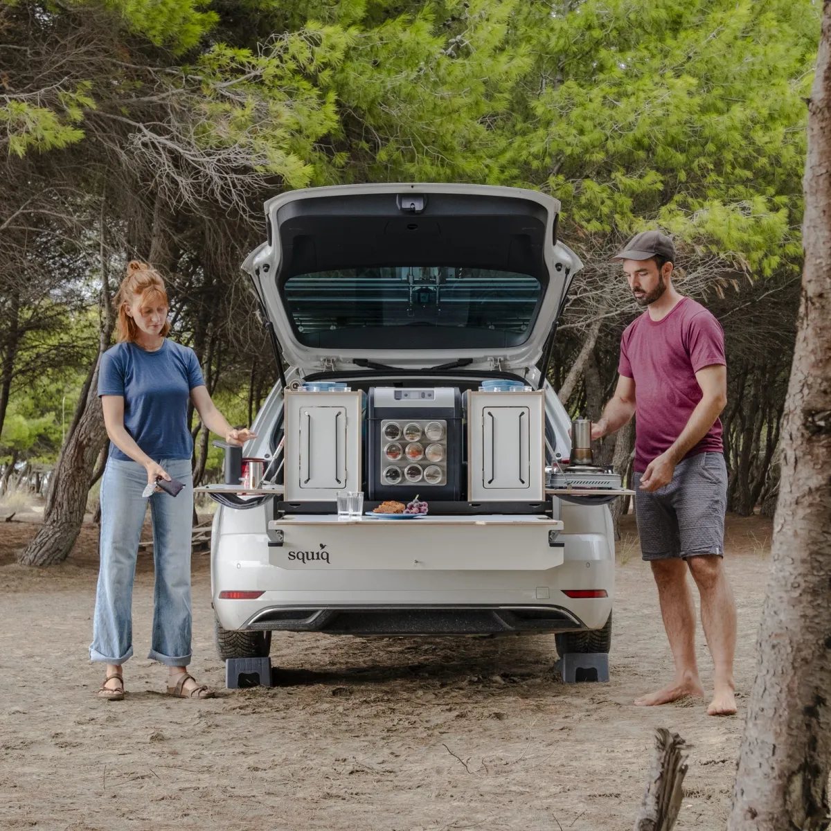
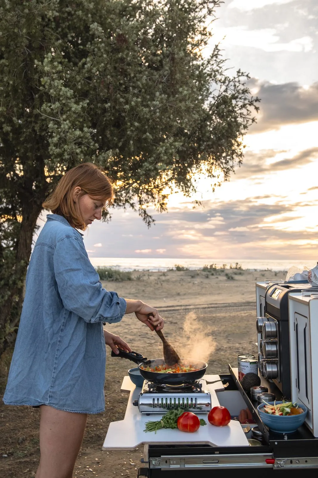
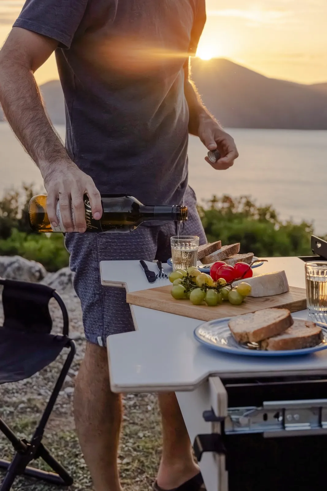
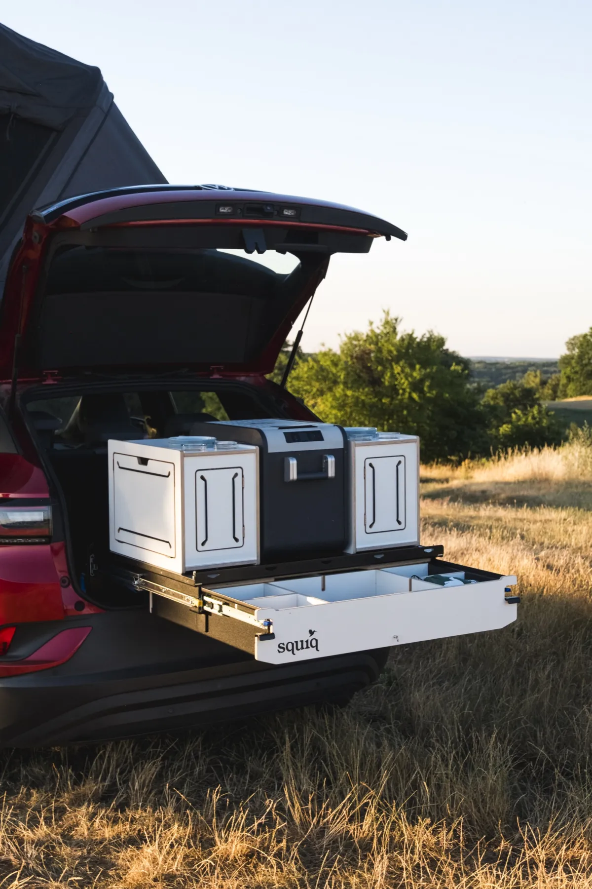
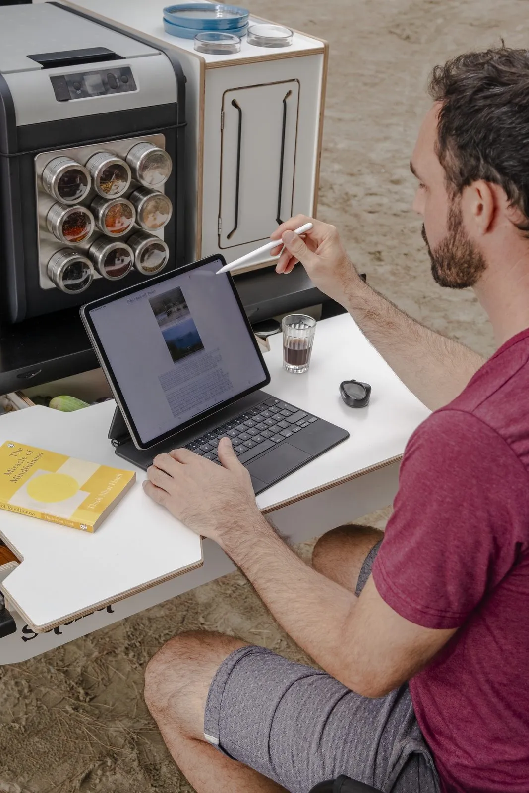
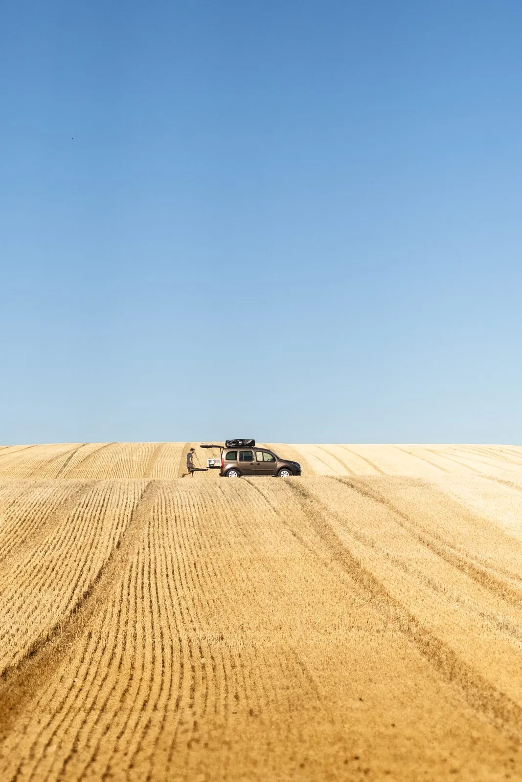
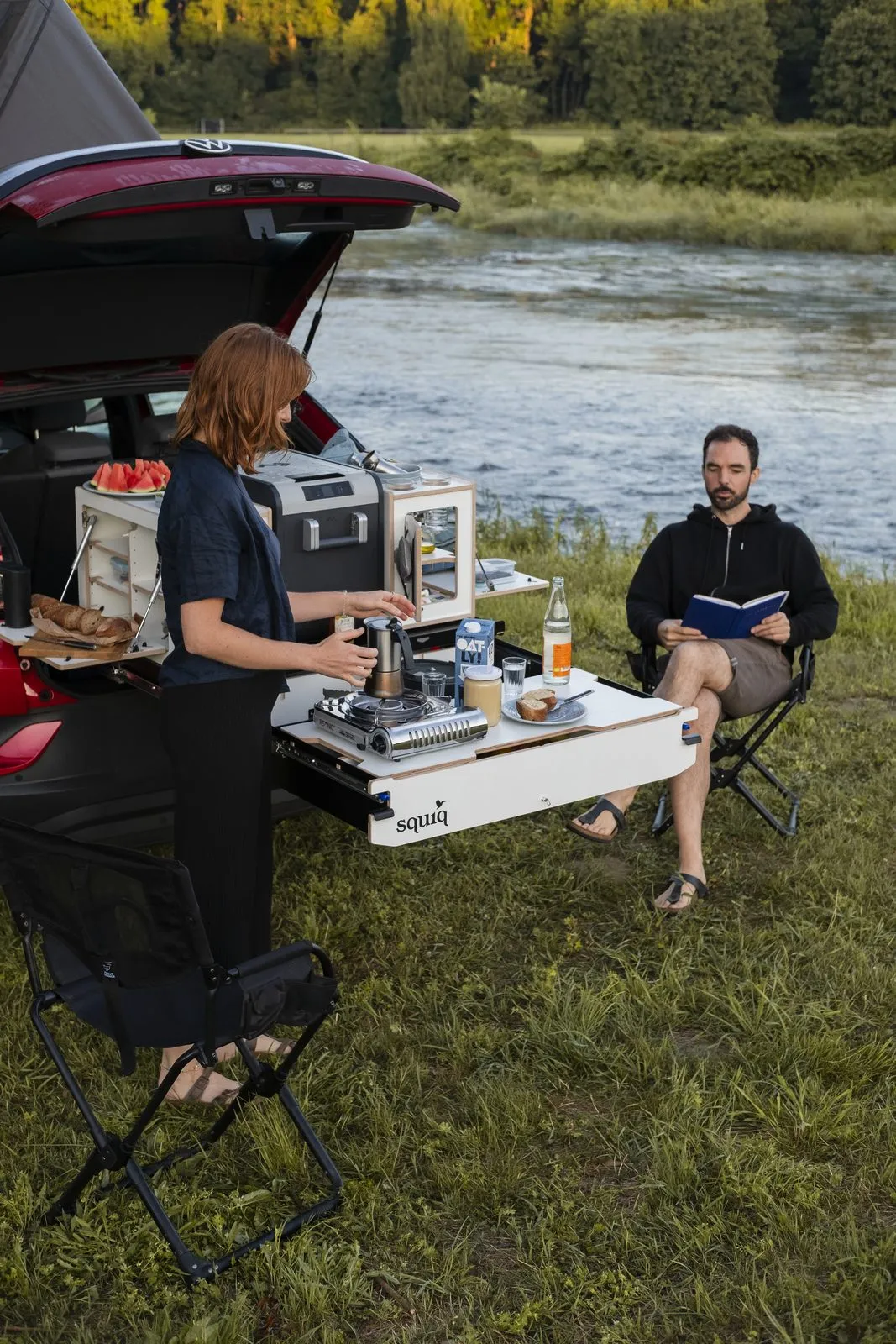
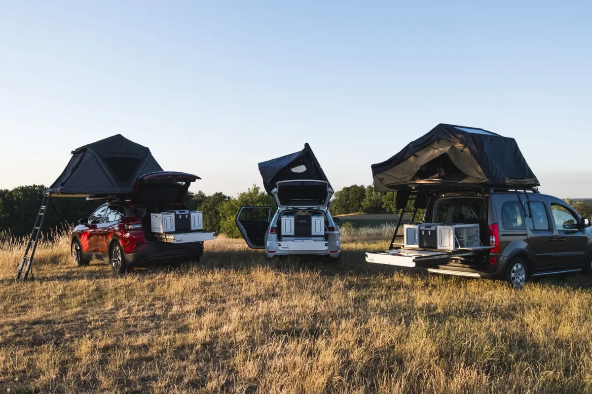
The Albanian coast in September, a summer meadow in June: we photograph squiq where it gets used, with real people, real food and whatever light the day brings. That’s where the images for the shop and social media come from.
-
03
One pull, three models
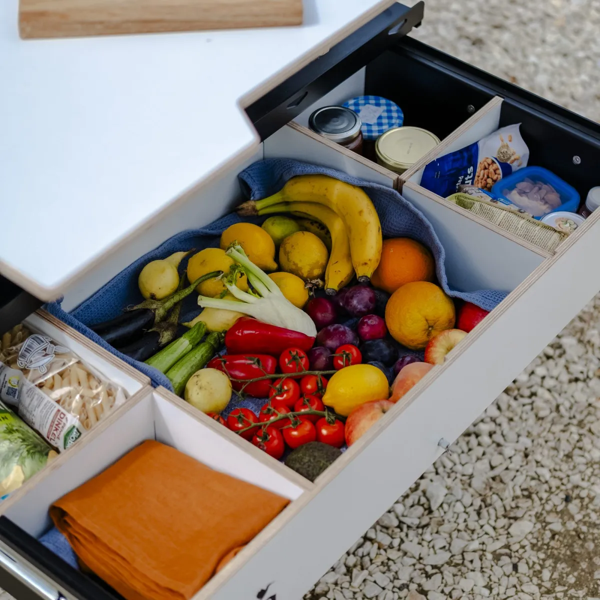
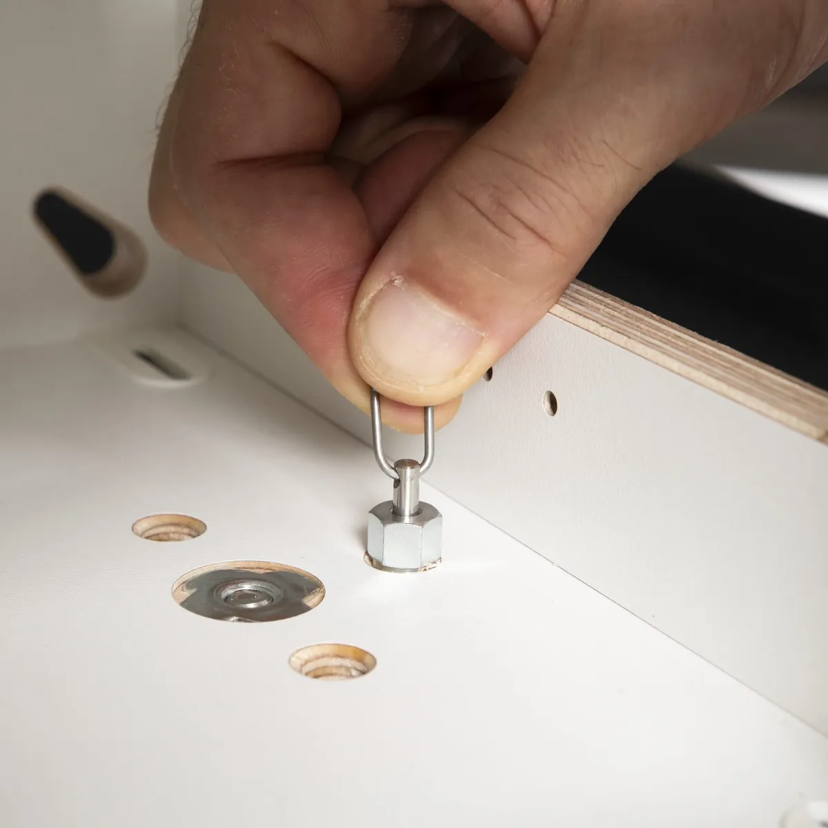
In the studio we show what gets lost outdoors: how the drawer slides, how the boxes slot together, what fits in which car. The photo series turn into short loops: tailgate up, kitchen out.
From a pile of drafts to the finished logo.
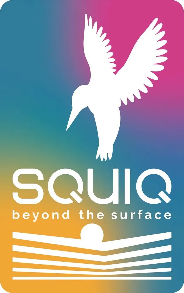
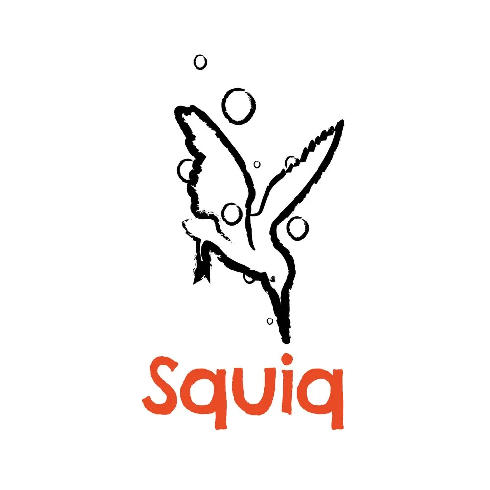
It all started with a working logo, complete with gradient and claim. We developed three directions: a clear silhouette, a mark in a frame and a loose brushstroke. The silhouette won, paired with a wordmark of its own and the sun as an extension.

The images in detail
A selection from the 2024 shoot in Albania and the summer 2025 shoot, plus the studio.
The system behind it
-
Sun over black
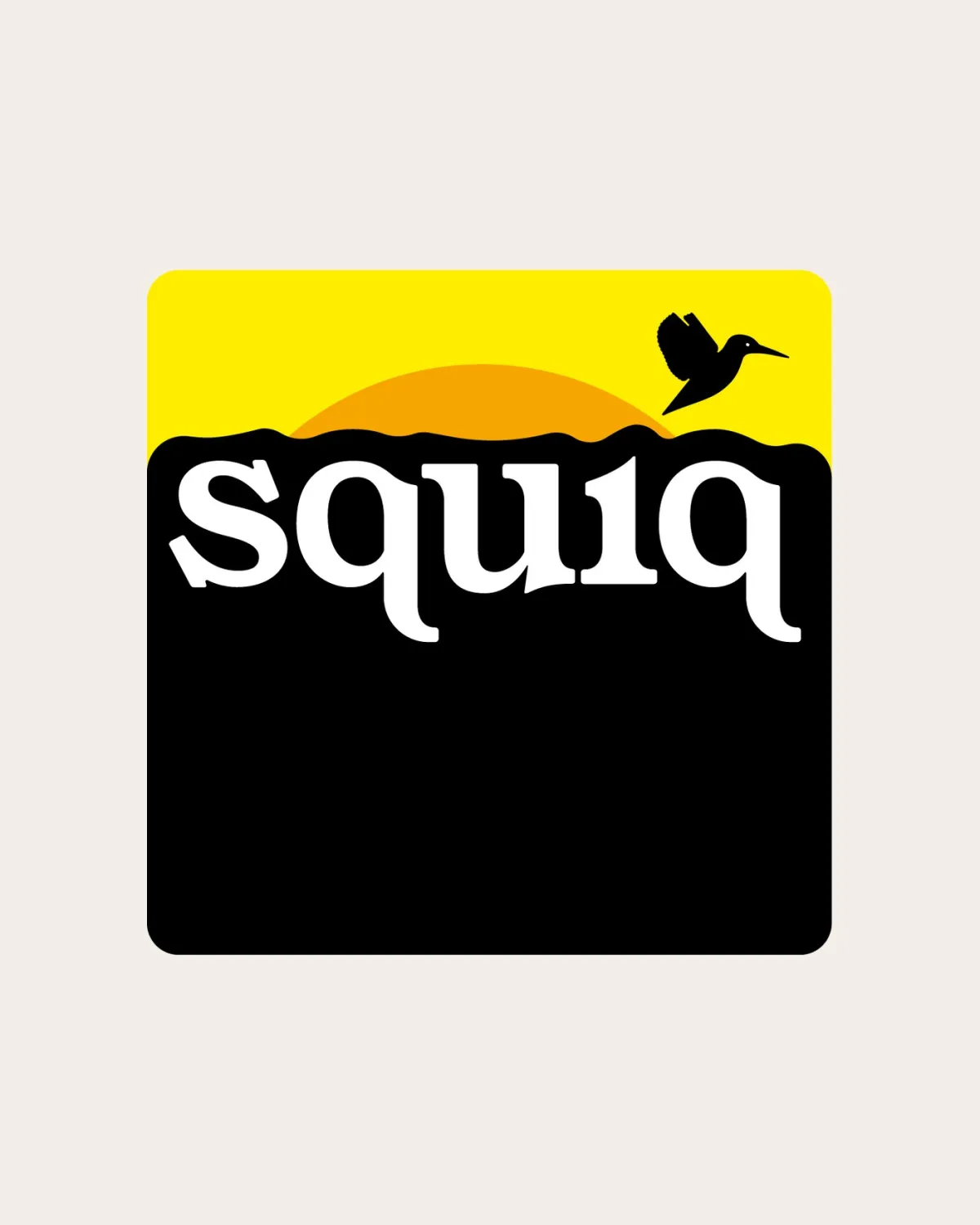
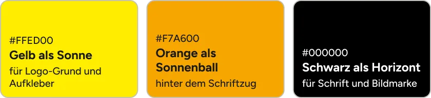
Yellow #FFED00 and orange #F7A600 form the rising sun behind the lettering, black the horizon. For engraving, stickers and single-colour print there’s a reduced version with no colour at all.
-
Serif meets round
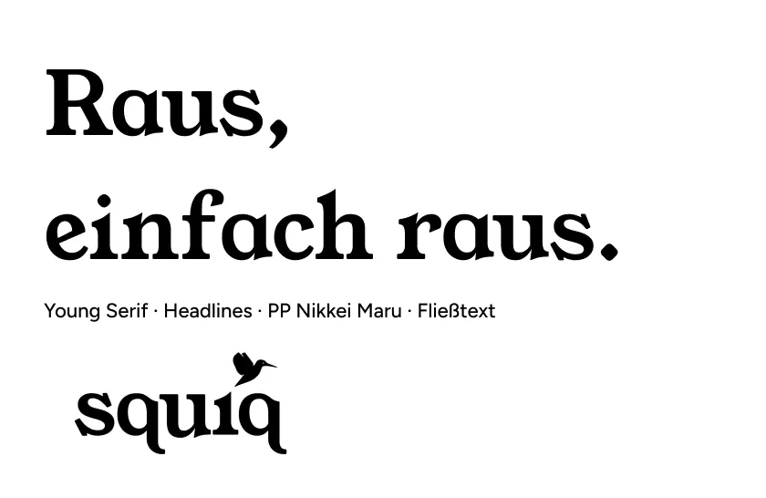
Young Serif sets the headlines and the lettering, PP Nikkei Maru the body text. Both are round and warm, just right for a brand that’s friendly and can handle a little rebellion.
-
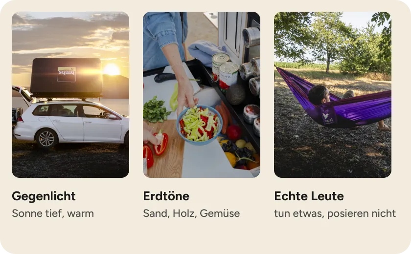
Real light, real people
Spontaneous, lively, young: the photos thrive on backlight and earthy tones and show people cooking, eating or hanging out rather than posing.
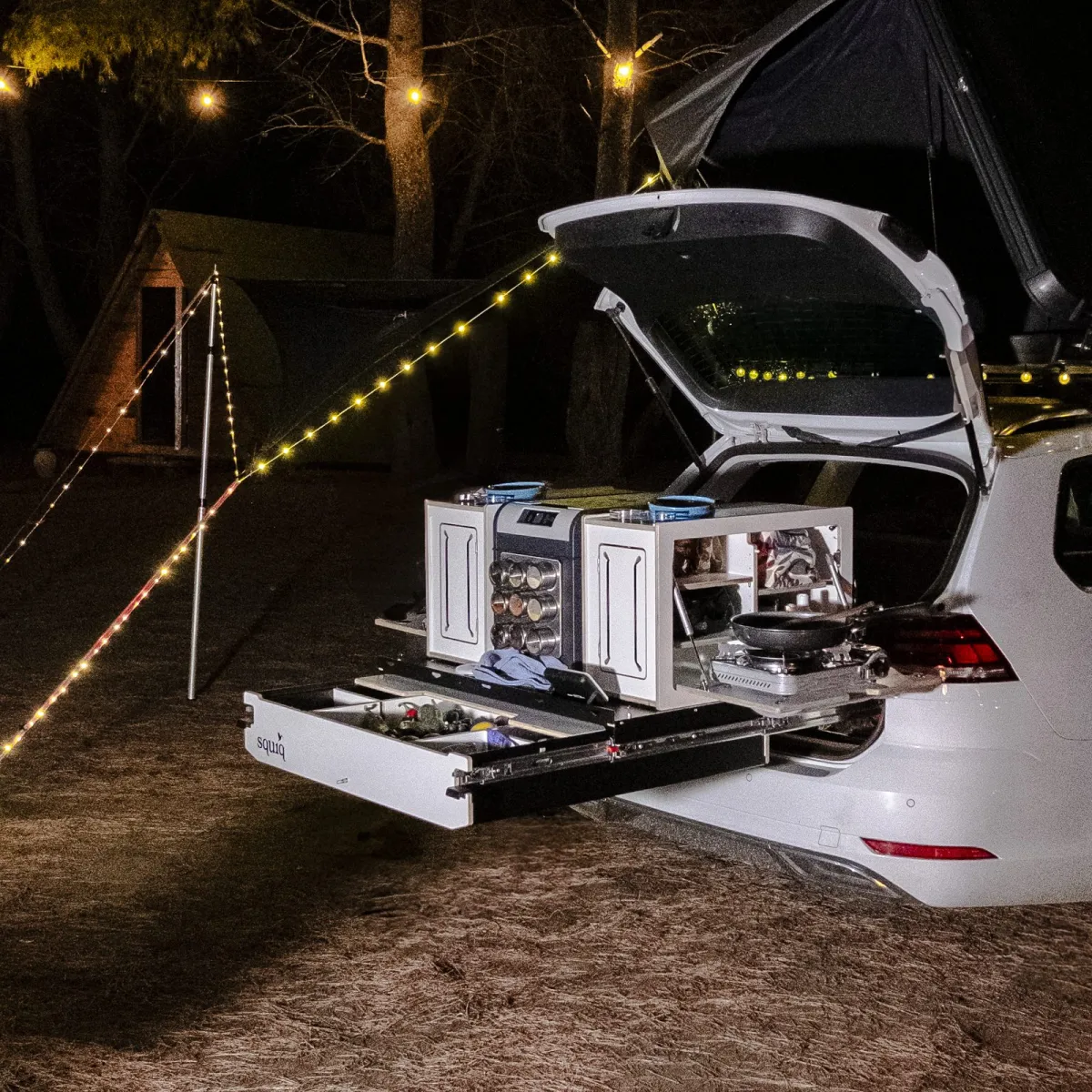
-
A mark that fits on every box.
The brand
Logo mark, wordmark and the sun variant cover everything: product stickers, shop and social media, in full colour and single colour.
-
Images that look like a holiday.
The images
Two shoots have produced more than 400 edited images, sorted by model and use, outdoors and in the studio.
-
Every model explains itself.
The product
Cut-outs, details and comparison shots show the Traveler compact, regular and max so you can see the differences without a data sheet.
-
Tailgate up, kitchen out.
The animations
Short loops from the photo series show the drawer and the turntable view, for the shop gallery and social media.
Want your product to look like it belongs outdoors?
Tell us what you’re building and where it’s headed. You’ll get an honest assessment and a price before we start.
Start a project