JaraVan
Logo, illustration and website for a new camper service in the Nürnberger Land region that knows every vehicle inside out.
- Branding
- Illustration
- Web
- 2026
- Branding
- Illustration
- Web
Mechanics are everywhere. JaraVan is your mate.
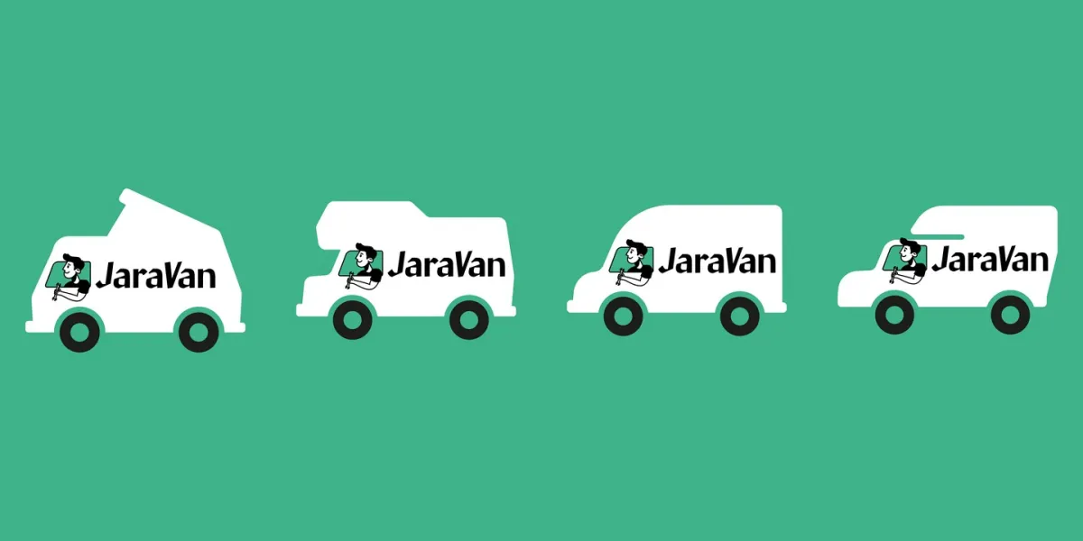
In 2026 Lorenz Jarallah is setting up on his own in Hersbruck: electrics, heating, gas and off-grid systems for campers, vans and tiny houses, with a mobile service on request. He came to us with a hand-drawn illustration but no logo. We turned it into a character, built a logo family for every vehicle type, put together a compact brand guide, and designed and built the website at jaravan.de.
- 1 character
- 3 design rounds
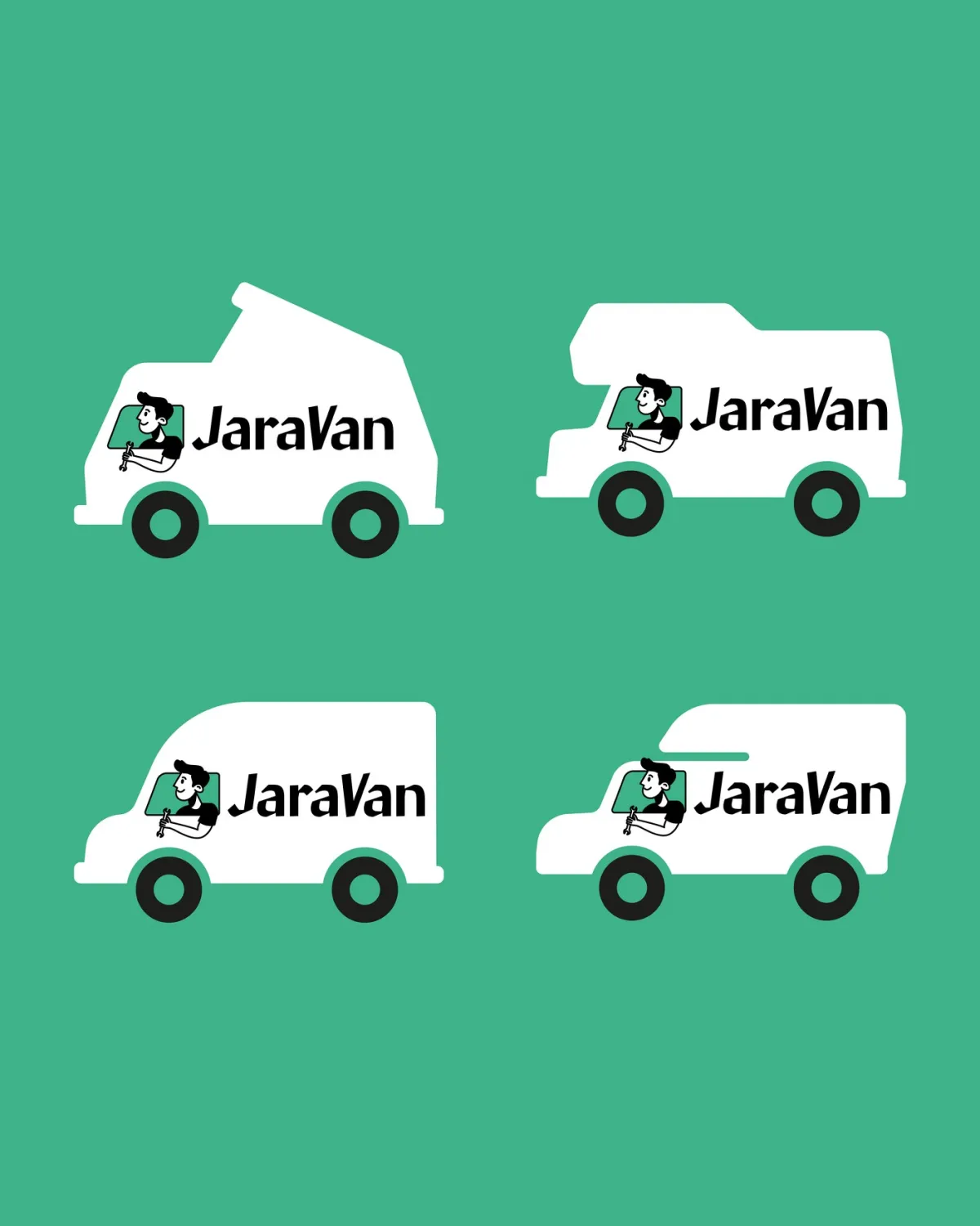
- 4 vehicles, one badge
Character, vehicles, leisure
Three chapters, from the old drawing to the sign on the yard gate. Website footage from jaravan.de, applications as mockups.
-
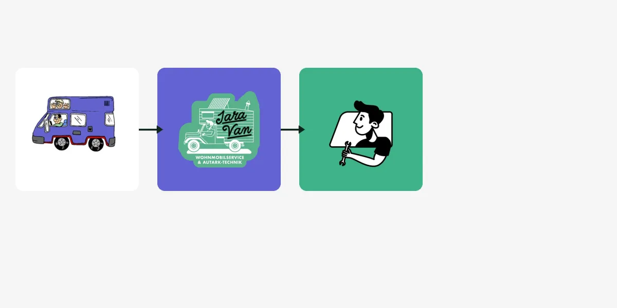 01
From bus to buddy
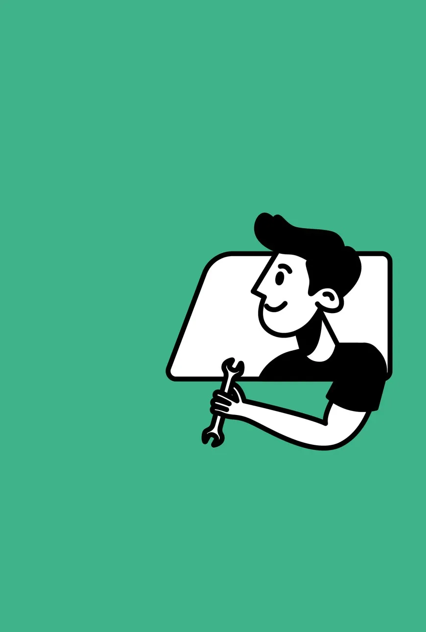
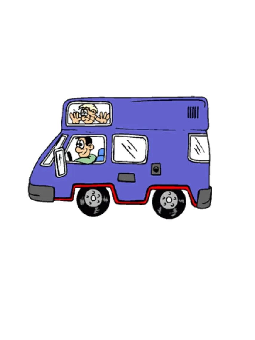
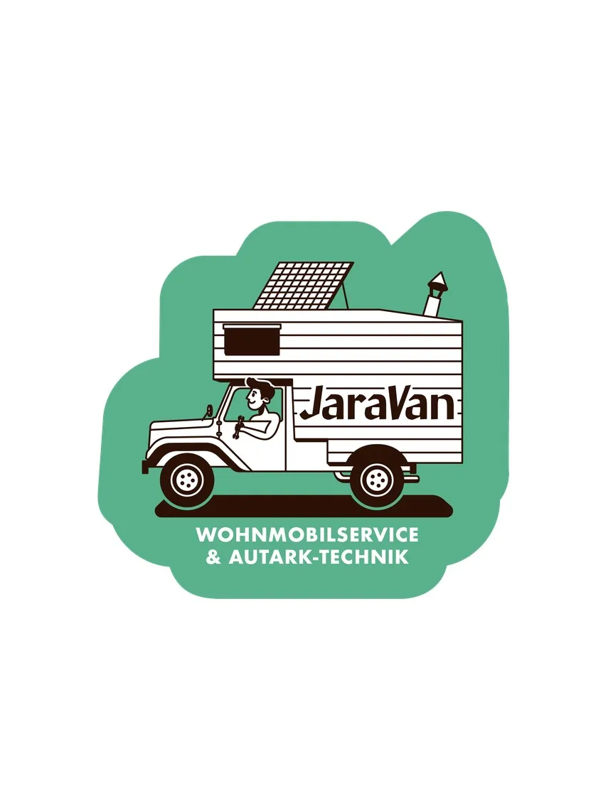
The old drawing had charm but no system. We kept its heart, the friendly guy at the wheel, and redrew him: clean lines, few fills, a spanner in his hand. Now the character works everywhere from the favicon to the workshop wall.
-
02
One logo, four camper types
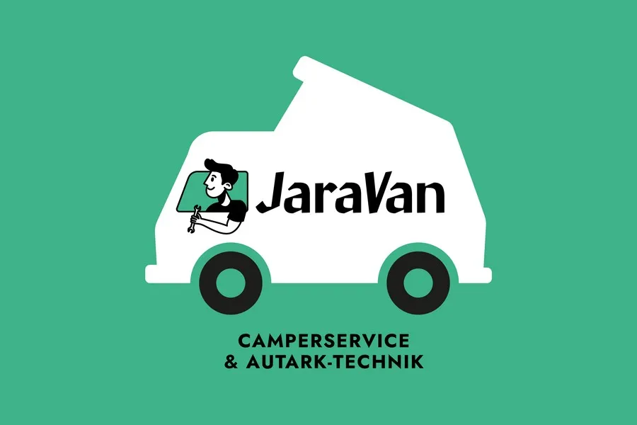
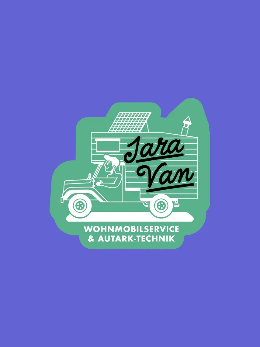
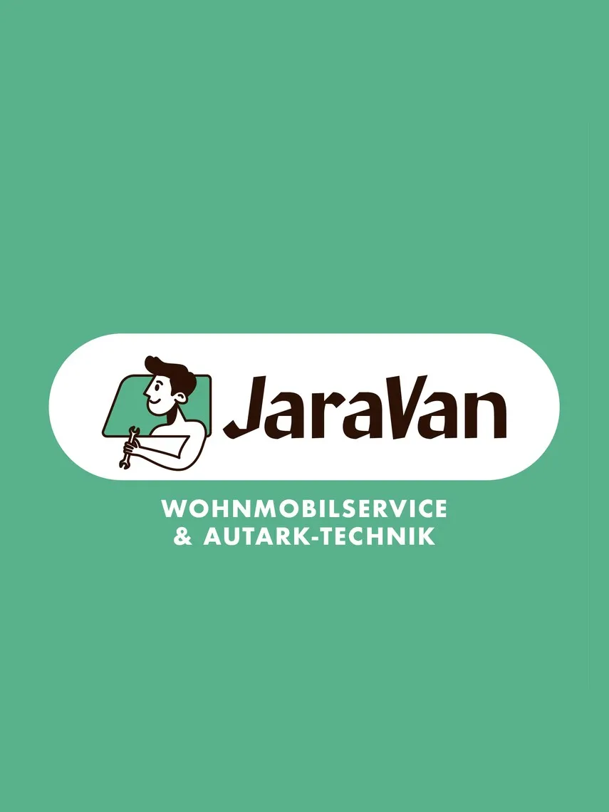
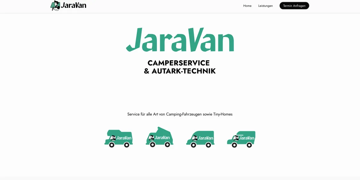
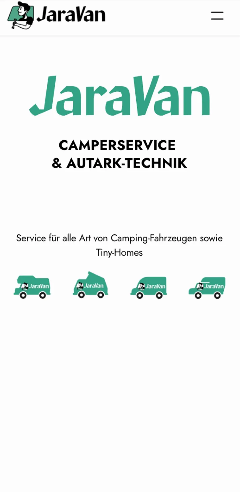
The badge, character plus lettering, sits inside four silhouettes: panel van, over-cab, pop-top and pickup. Every customer spots their own vehicle. On the home page the four sit right below the logo and say it without words: every camper gets looked after here.
-
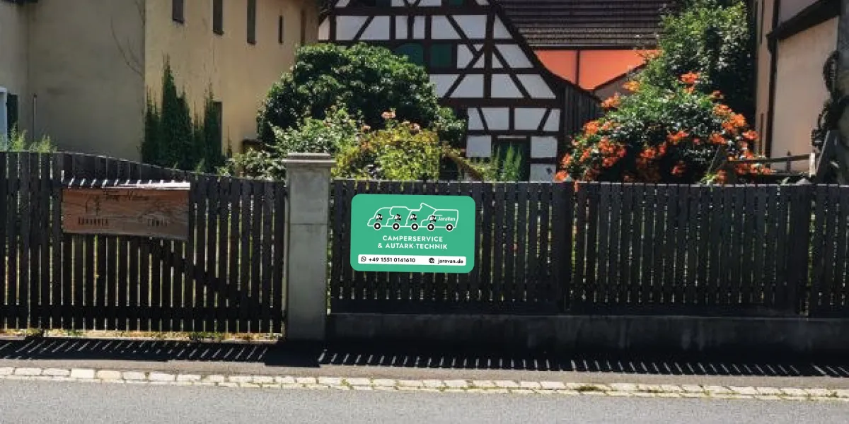 03
The brand out and about
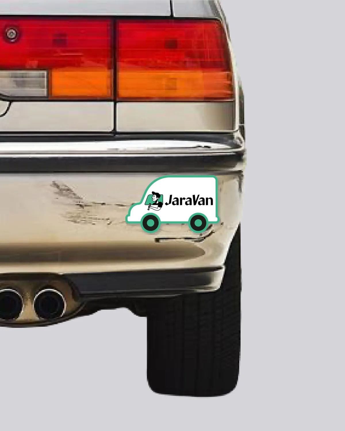
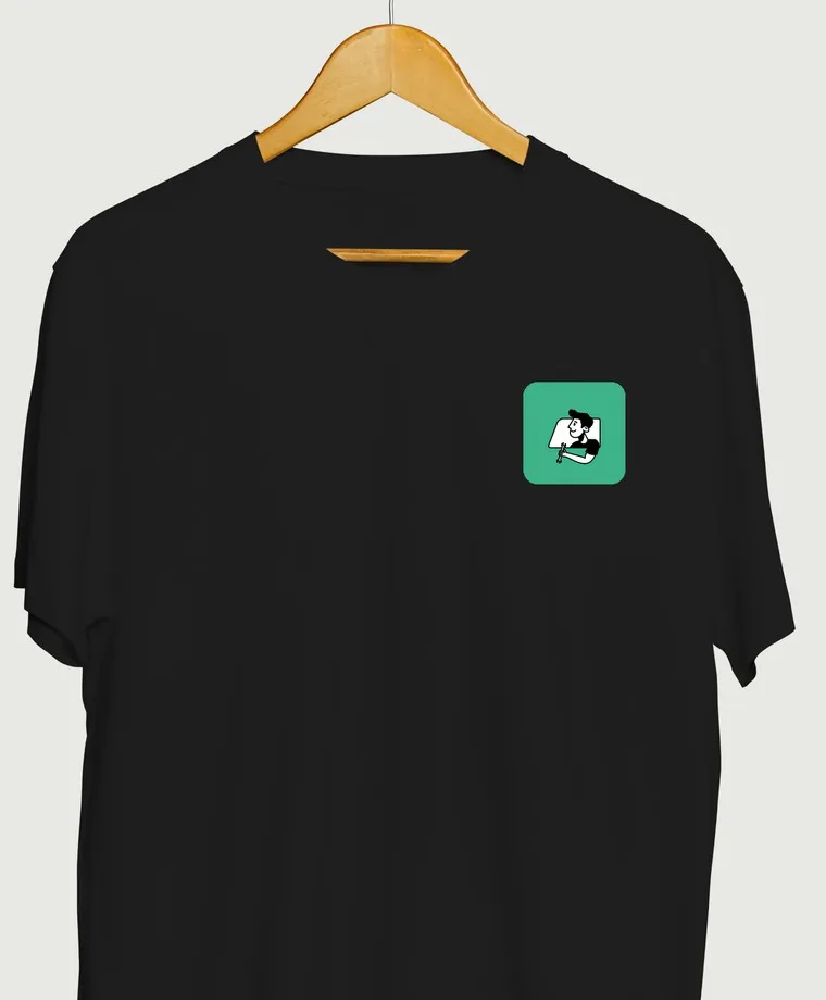
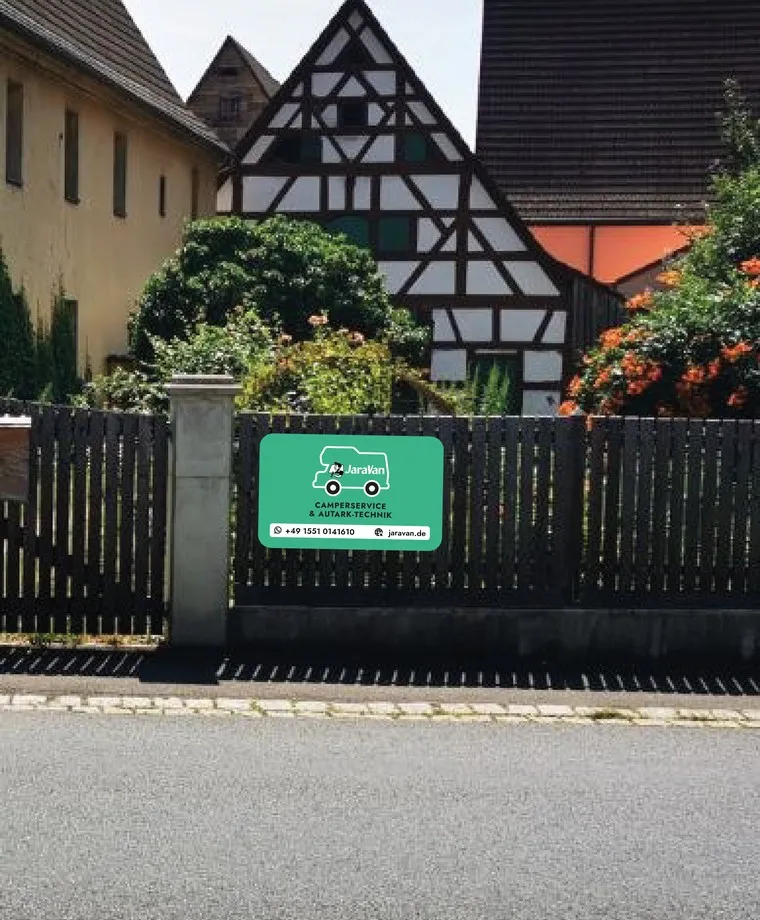
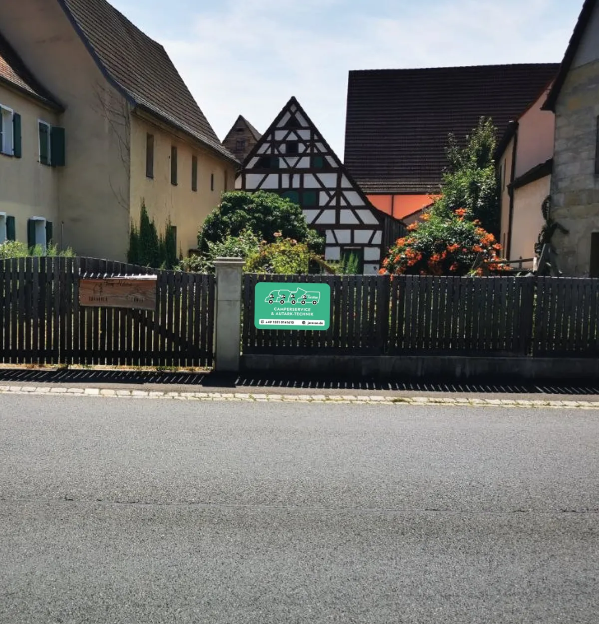
Company sign on the yard gate, sticker on the bumper, shirt for call-outs: we worked out where JaraVan turns up day to day. Green on white stays legible from a distance, and the character works as a small patch too. Not produced yet, shown here as mockups.
An old drawing becomes a face.
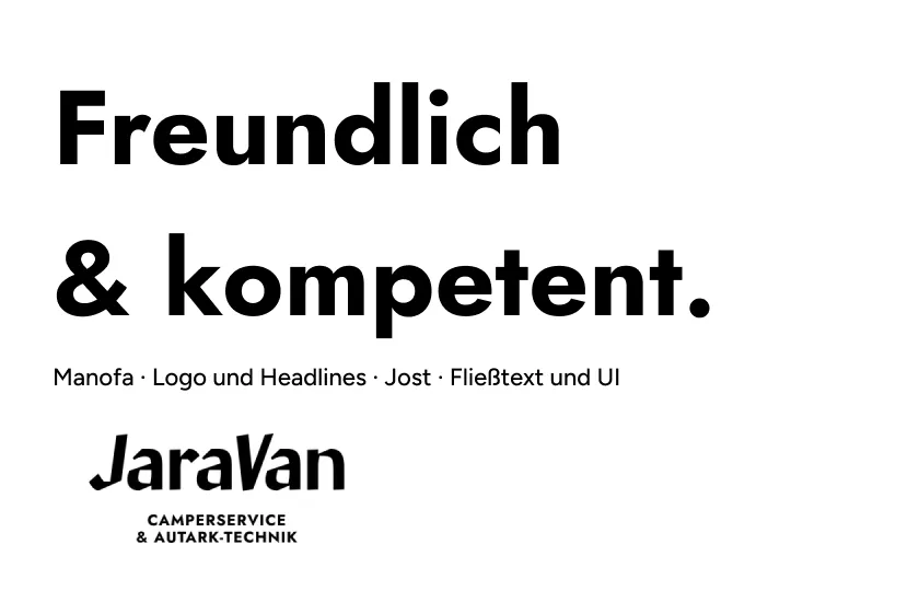
The starting point was the blue bus drawing Lorenz had been using. In the first draft we showed four directions; the helpful friend next door won. Over three rounds, the driver in the truck became a character in the window, and that became the badge. Manofa carries the lettering, Jost everything else.
The brand out and about
Sticker, shirt and company sign as mockups. Not produced yet, but that’s the plan.
The website in detail
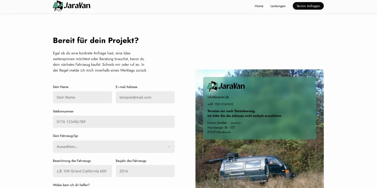
Home, services and contact on desktop and mobile, captured on jaravan.de. Designed and built in Framer, and still growing.
-
Home
-
Services


-
Contact

The system behind it
-
Green that gets stuck in
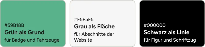
JaraVan green #59B18B carries the badge, the vehicles and the areas in the logo. Black draws the character and lettering, light grey #F5F5F5 brings calm to the website’s sections. Every logo also comes in a version on white.
-
Calligraphic meets geometric
Manofa sets the lettering and large headlines, with the swing of quick handwriting. Jost handles body text, forms and promotional material: clear and easy to read.
-
Green glass, real van
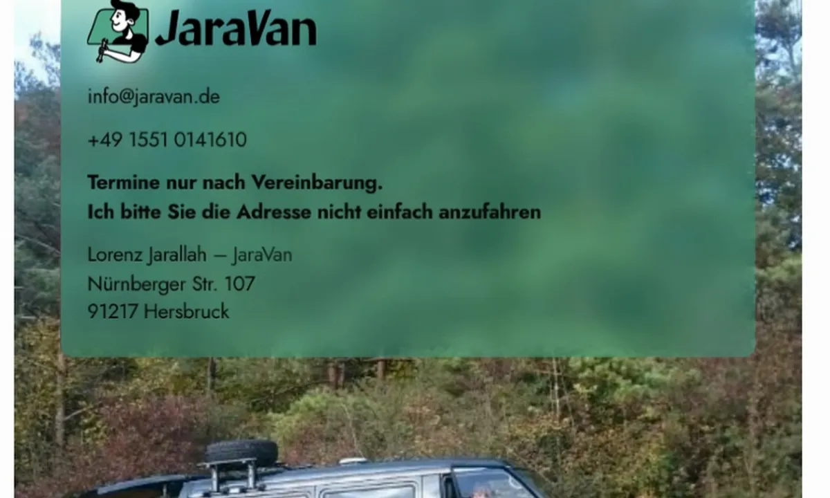
On the contact page, the business card floats as a pane of green glass over a photo of a van out in the countryside. The blur keeps the address and phone number legible while letting the vehicle show through. It’s the one place where the otherwise calm site uses an image rather than flat colour.
-
A face you’d call.
The character
A founder without a long track record needs a face people trust. The character gives JaraVan exactly that, before the first customers have had a chance to form a view.
-
Everyone finds their camper.
The vehicles
Pickup drivers don’t wonder whether they’ve come to the wrong place. Lorenz doesn’t have to explain his offer first, the badges do that for him.
-
From the yard gate to the bumper.
The applications
Working on the road means being seen on every job. Once the sign, stickers and shirt are produced, the name will stick around after the visit too.
-
Three pages, one way to book.
The website
For a business that’s just starting out, every enquiry counts. The site skips the detours so that a visit quickly turns into a conversation.
Does your business need a face?
Tell us what you do and who you want to reach. You’ll get an honest assessment and a price before we start.
Start a project