Archive
HilNet
Campaign and branding for the learning platforms of the University of Hildesheim.
- Campaign
- Branding
- Campaign
- Branding
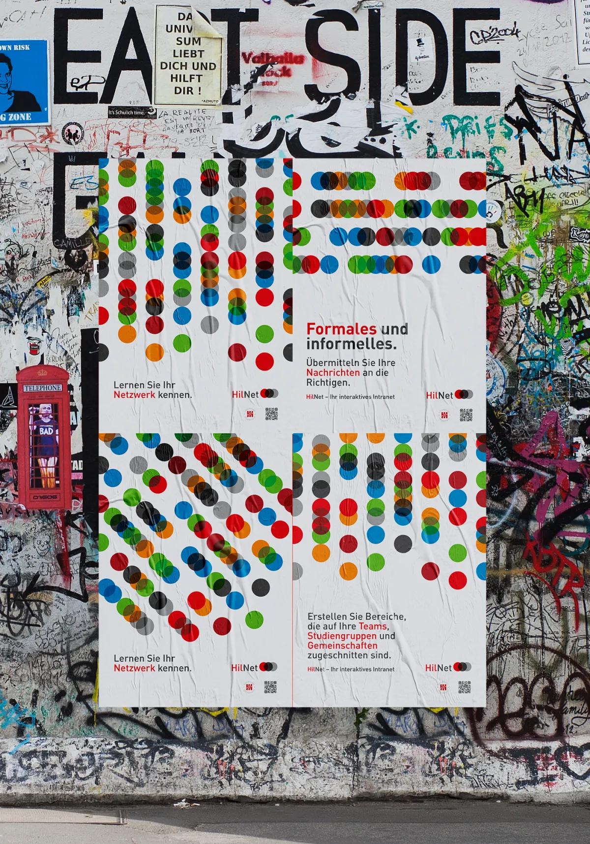
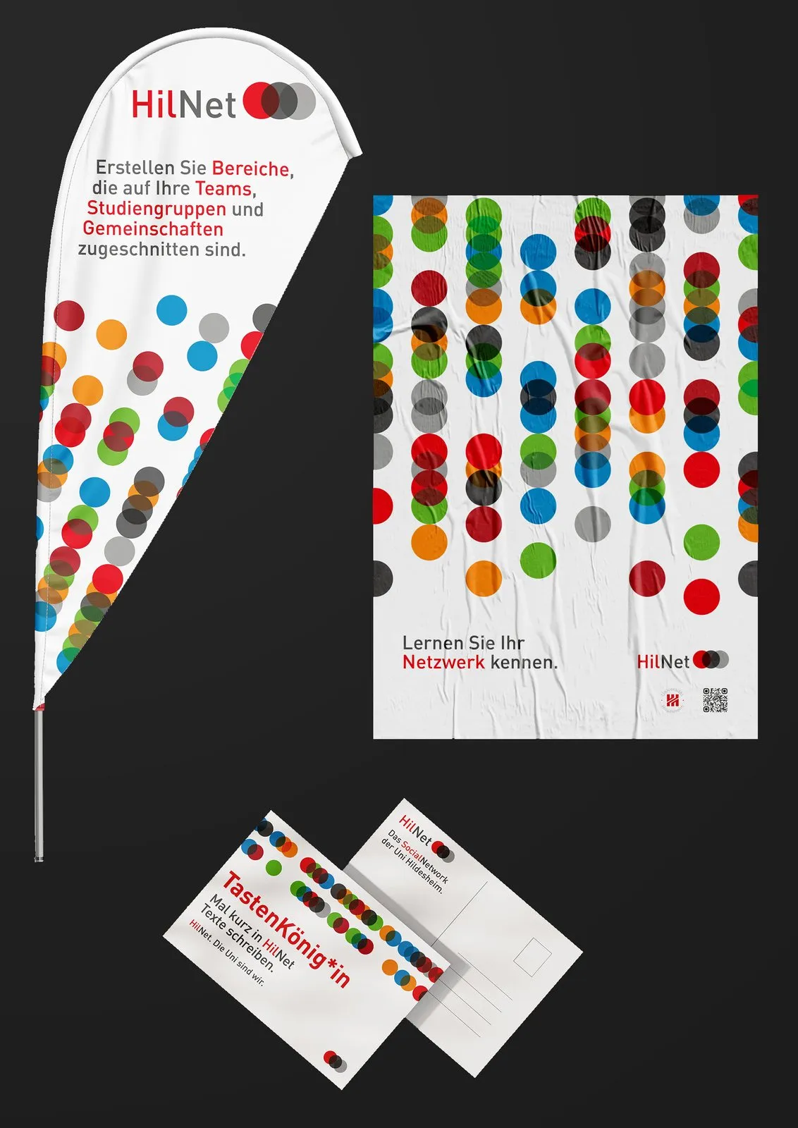
Every dot is a part of the university.
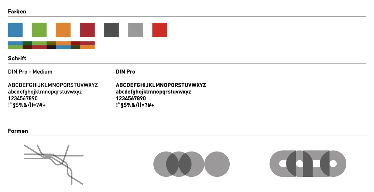
Everything starts with the University of Hildesheim’s colour palette: light red, grey and dark grey make it recognisable and give the design a calm base. On top of that, each of the four faculties adds its signature colour: green, blue, orange and dark red.
01 · System
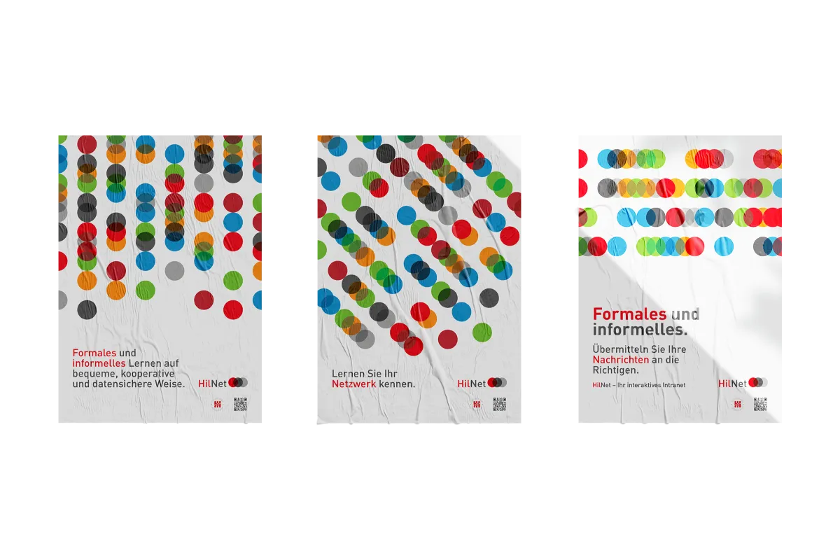
Four faculties, four colours, one data stream.
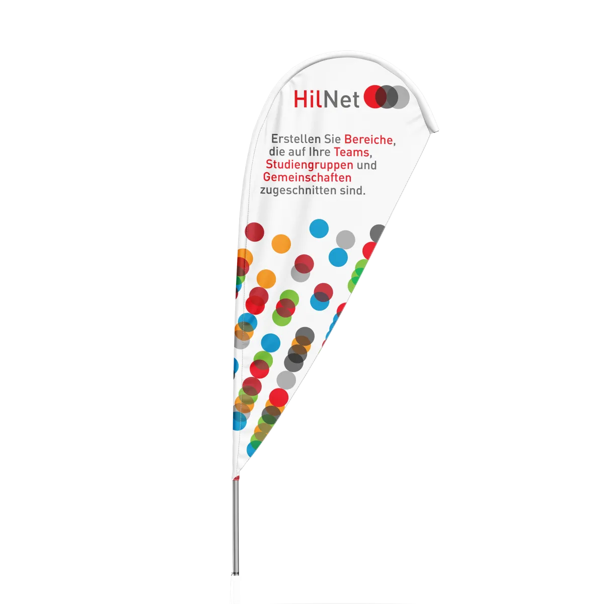
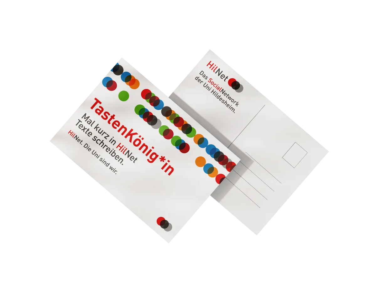
The colours become dots. Each one stands for a part of university life: faculties, people, ideas and knowledge. Together they form a data stream that runs through posters, beach flags, flyers and cards.